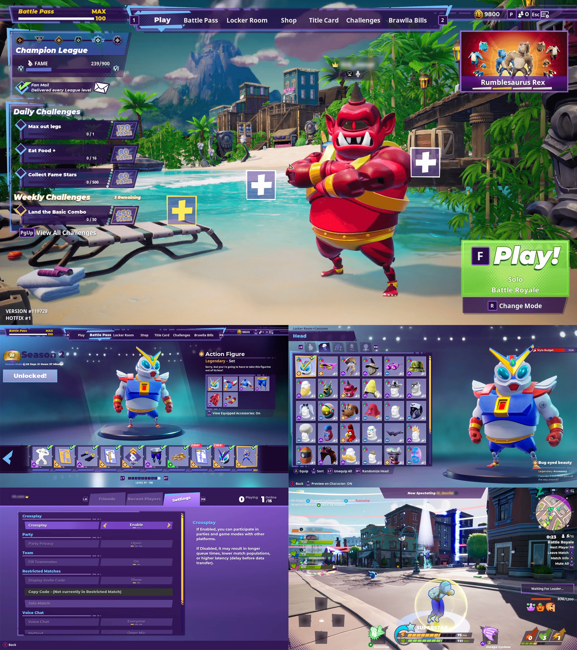
Rumbleverse was a free-to-play brawler battle royale video game developed by Iron Galaxy. During its development the project leadership asked me to review the front-end UI and the in-game HUD to see how we could make the overall UI more cohesive both in terms of layout and art style. At the time I was deployed to another project, so this initiative would be running in parallel to my main deployment.
Goals/ The game’s UI had been developed in phases and as such there was a bit of disconnect from one phase to the next. As a result, screens had varying layouts, which resulted in elements such as columns, headers and footers being different sizes from screen to screen. The first goal was to develop a grid system that would make the screen layouts more uniform.
The second goal was to update the art style as there had not been consensus in terms of signing off on the art direction, and as such there wasn’t cohesion, particularly between the front-end and the in-game HUD. I’d be working with a Senior UI Artist to iron out what that new style would be.
Grid development/ I began by taking a look at the current state of the game UI and identifying inconsistencies between screens while also consulting the UX Designer who had developed the initial wireframes to make sure I understood the priorities for each screen. After identifying shared content types and locations I created an initial grid that could be applied to the front-end of the UI.
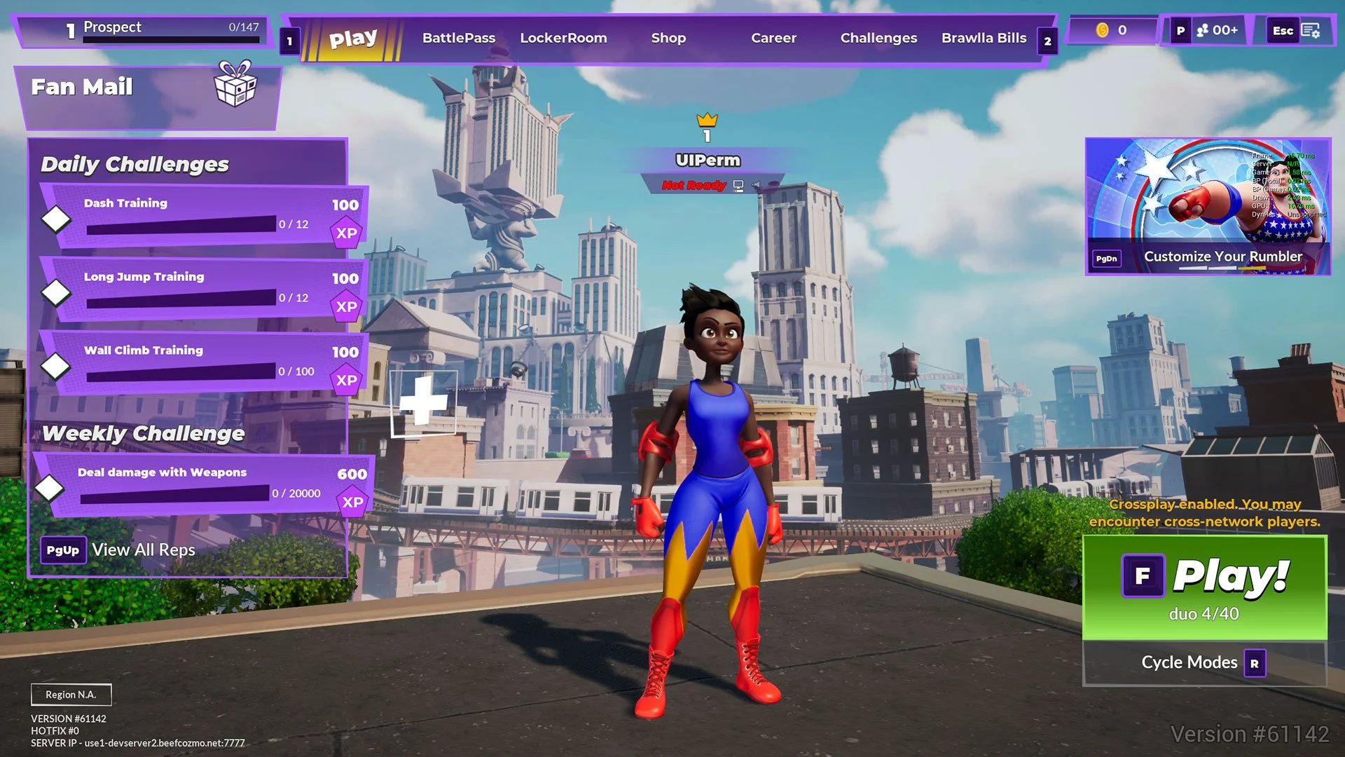
Landing Screen before update.
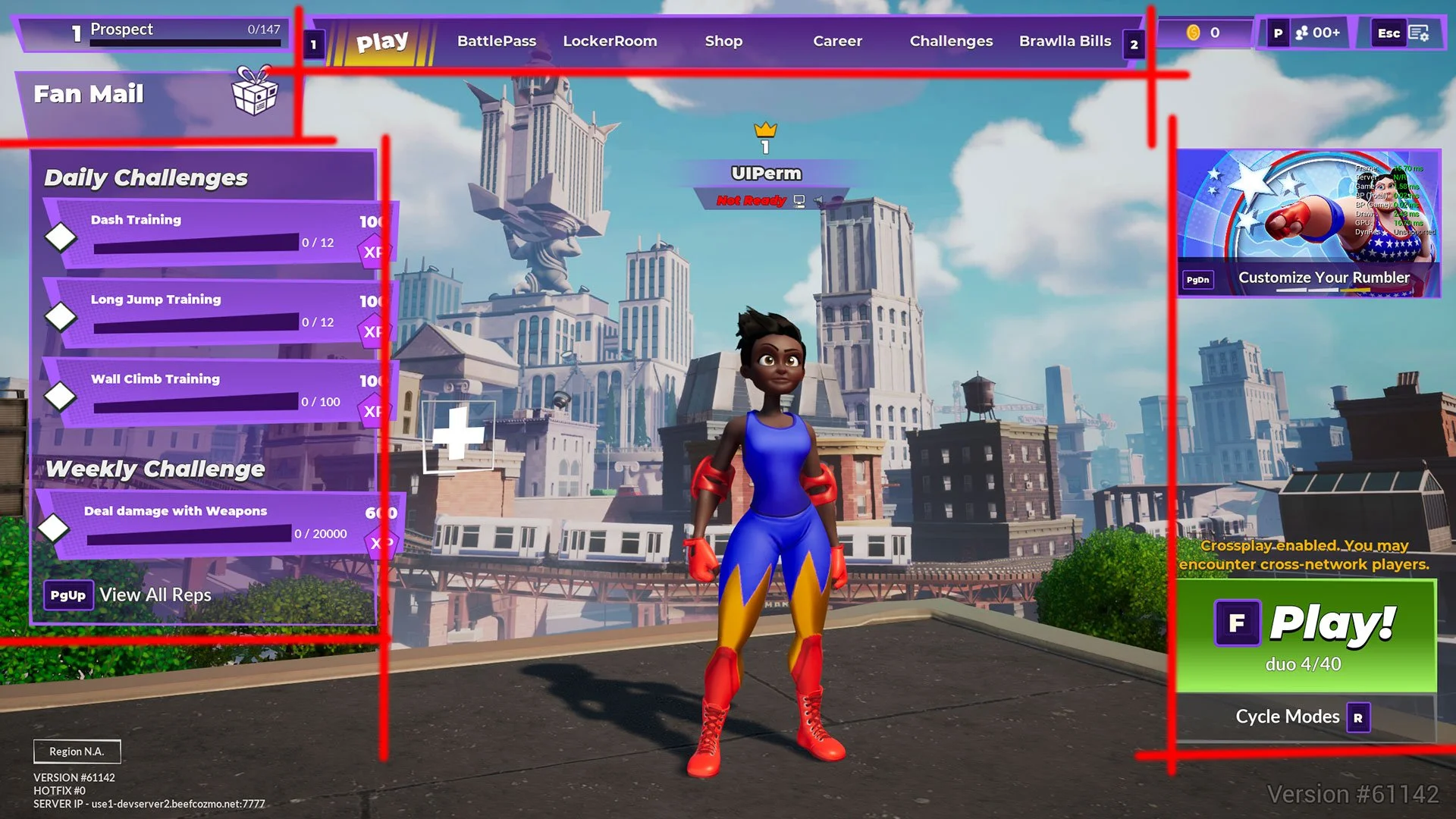
Redlined Landing Screen showing alignment issues.
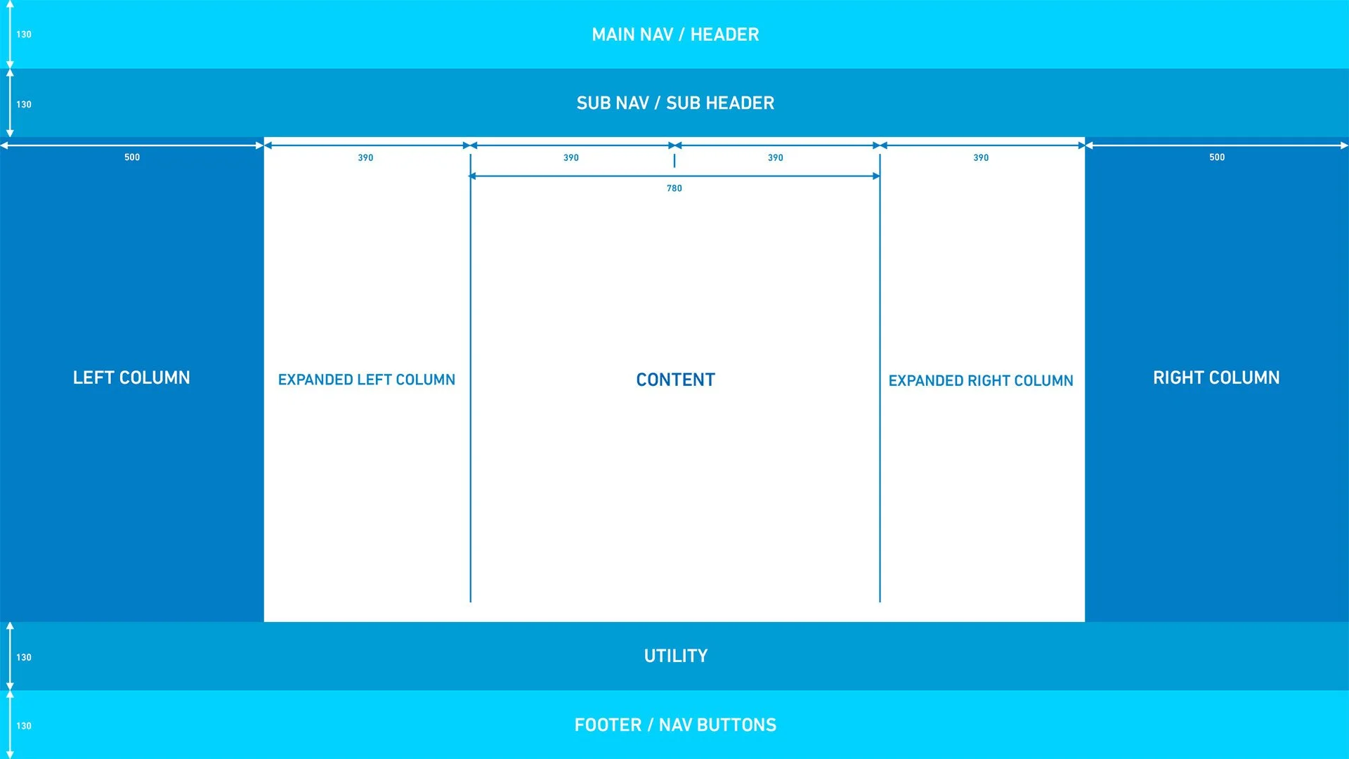
Initial front-end grid.
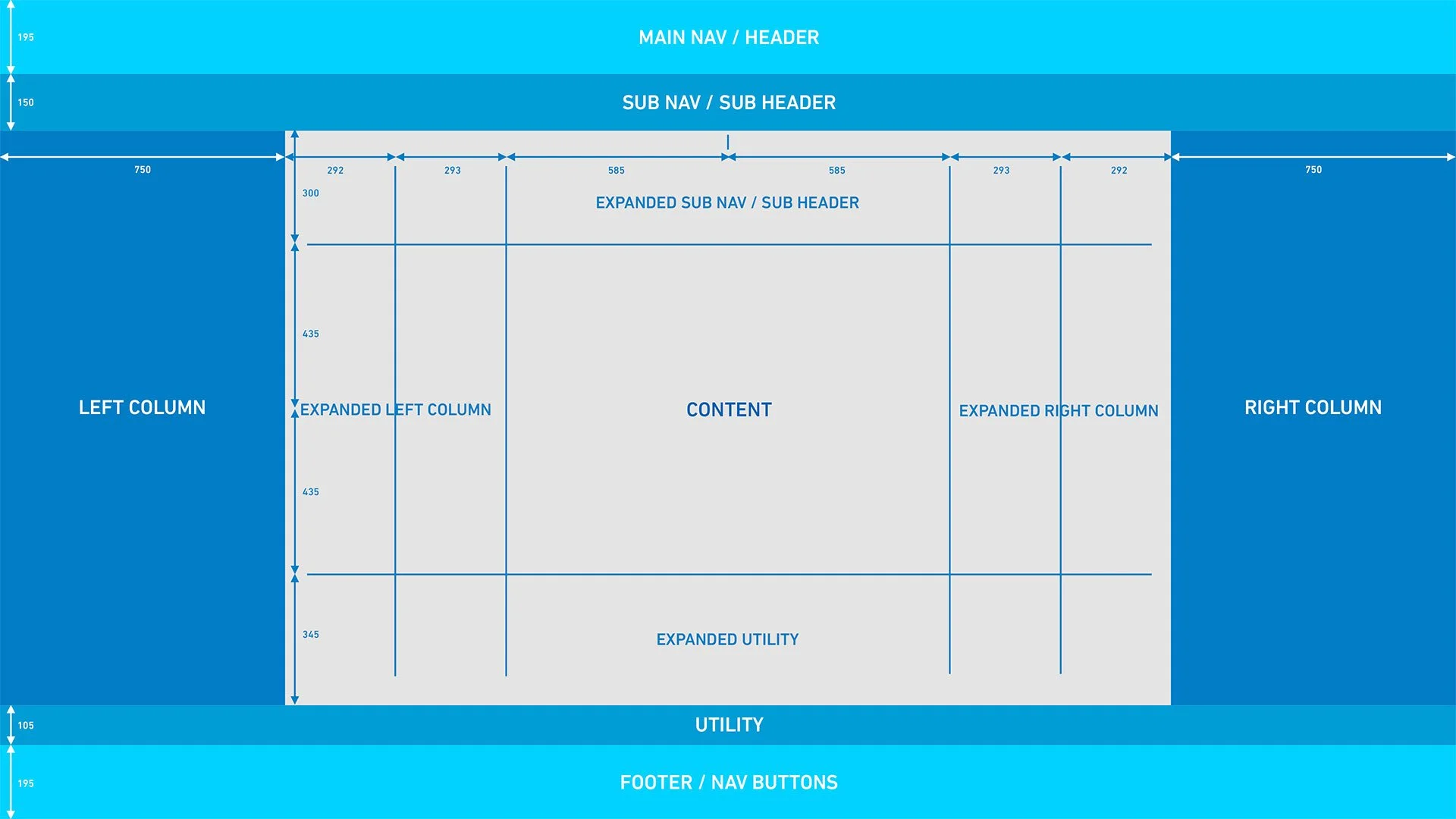
After overlaying the grid on the then-current screens, I adjusted some of the dimensions, particularly to accommodate the BattlePass.
Updated front-end grid with divided expanded lateral columns.
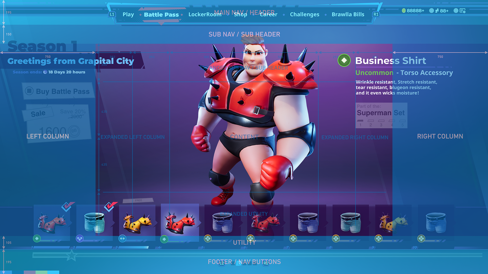
Updated front-end grid overlayed on Battle Pass.
From there I looked over the in-game HUD and began the same process to organize the information on the screen, with particular focus on the Items Menu and various callouts that would appear on-screen. With Rumbleverse being a game that would have multiple players on screen at any given time, the overall push was to move as many elements to the edges of the screen and allow more real estate in the center, while also making pertinent information easy to see.
State of the HUD before developing grid and new art style.
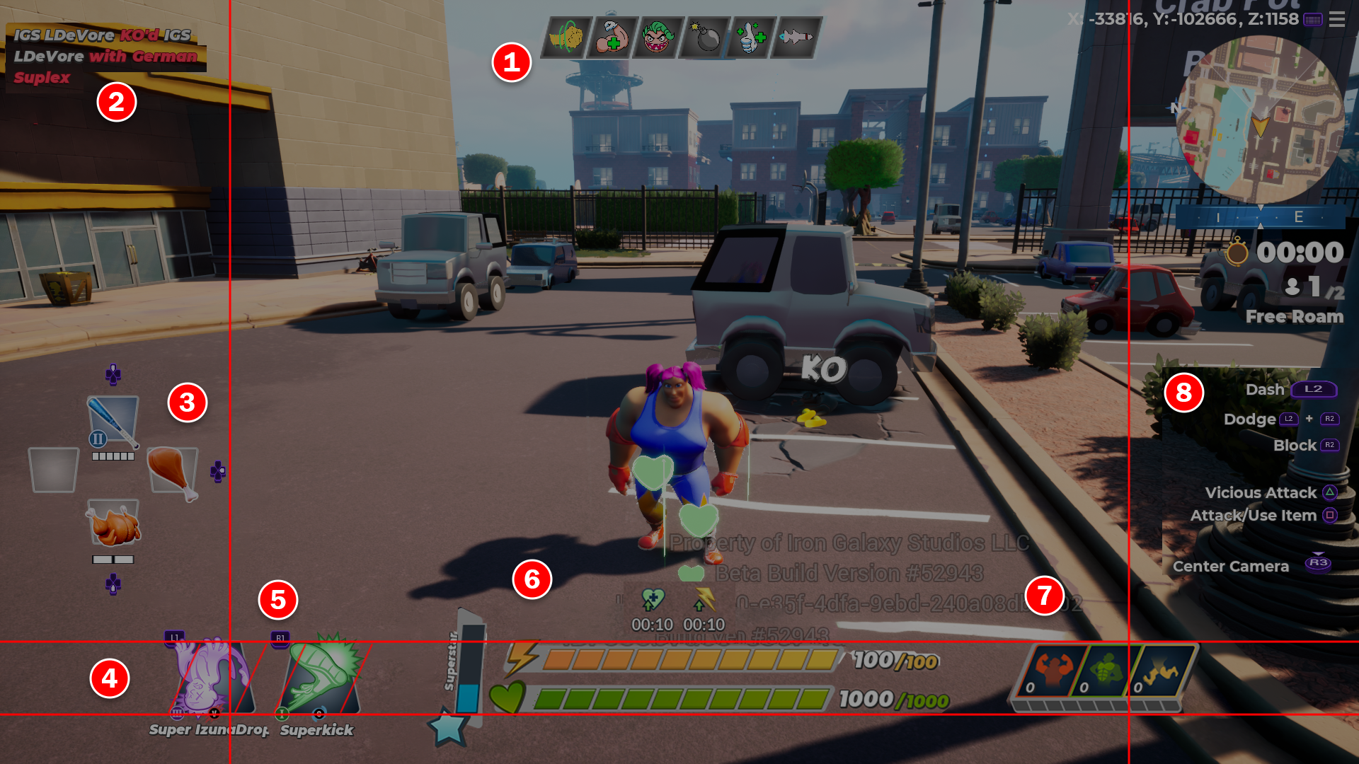
Redlined HUD with improvement recommendations.
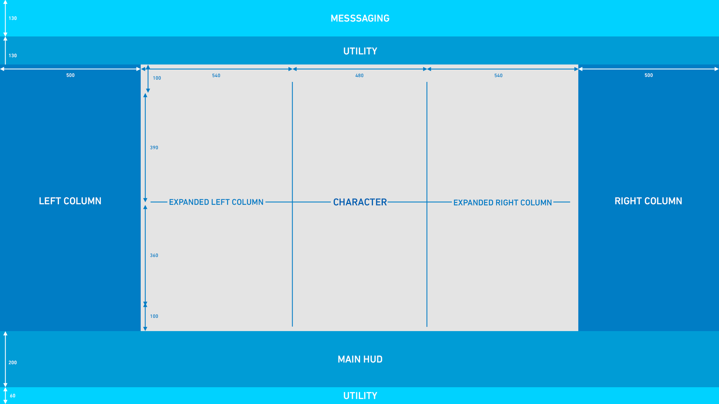
In-game HUD grid.
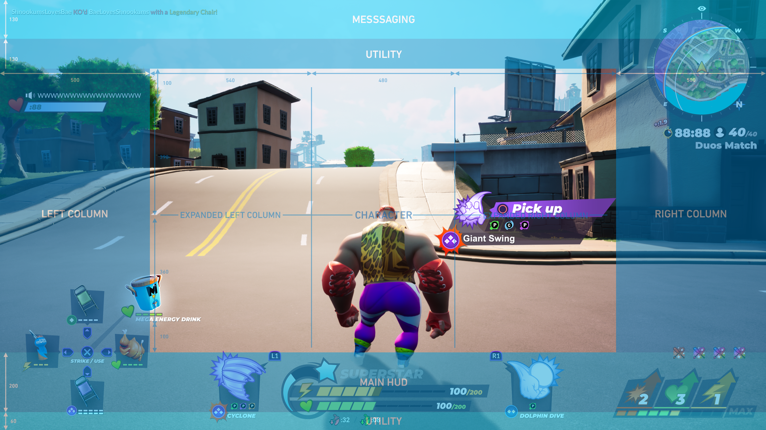
Updated in-game HUD.
Art Style/ While I was working on the layouts of the UI, the Sr. UI Artist was working on ideas for the updated art style. I did a quick competitive analysis, looking at some of the other battle royale games and their color palettes and visual styles so as to find ways to have our UI be distinct. Once we established a color palette, the Sr. UI Artist began mocking up ideas for the front end UI, which I provided feedback on before presenting to the project leadership. Once this was signed off on, we both worked on updating the HUD to match the new style.
Original Landing Screen (L) and first pass at updating the art style (R).
We began by reviewing the Items Menu, Health/Stamina/Star and Boost meters. With the grid established, we needed to not only have these elements match the art style, but fit within the grid so that they didn’t encroach on the main playing area.
Ideas for the Items Menu.
Ideas for the Life/Stamina, Superstar and Boost meters.
After presenting various iterations, the project leadership chose the direction for the elements and this was propagated to the rest of the in-game UI.
Final product/ With both the grid system and art style established, the rest of the Rumbleverse UI Art team could now apply both to existing screens and any that were still left to be developed.


